Dropdown
Displays a list of actions, links, or options a user can choose between.
Needs JavaScript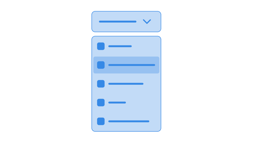
Dropdowns have to be accessible. We make use of ARIA attributes to make the experience work for everyone. Lucky for you though, you don’t have to worry about all of these. Zirconium handles all of it for you.
For the toggle, you need to create a button with the attribute data-toggle. Buttons with that attribute will toggle dropdowns that are immediately after the button. If your dropdown is placed somewhere else, however, you need to set data-toggle’s value to the id of your dropdown, like this example below:
<button class="button" data-toggle="dropdown-1">Toggle Menu <svg>…</svg></button>
<div class="absolute margin-top-s level-2 raised dropdown" id="dropdown-1">
    <a href="#!" class="nav-item">
        <span class="nav-item__main"> Dropdown Item </span>
    </a>
    <a href="#!" class="nav-item">
        <span class="nav-item__main"> Dropdown Item </span>
    </a>
    <a href="#!" class="nav-item">
        <span class="nav-item__main"> Dropdown Item </span>
    </a>
    <a href="#!" class="nav-item">
        <span class="nav-item__main"> Dropdown Item </span>
    </a>
</div>
JavaScript does not provide a layout for your dropdowns. Instead, it is recommended that you put your toggle button and dropdown together inside a .relative container, and put a .absolute class to your dropdown. You can also adjust the position of your dropdown by using the margin utility classes.
<div class="relative">
    <button class="button" data-toggle="dropdown-1">…</button>
    <div class="absolute dropdown" id="dropdown-1">
        …
    </div>
</div>
You can also add icons to your dropdown links or actions by adding an SVG or an img element inside your .nav-item elements. Putting them before your .nav-item__main element will place the icon to the left of the text, while putting it after will place the icon to the right.
<div class="dropdown">
    <a href="#!" class="nav-item">
        <svg>…</svg>
        <span class="nav-item__main"> Refresh </span>
    </a>
</div>
Reminders
Do not use this as a <select> replacement. This should be used for actual dropdown menus, or navigation links in mobile devices (i.e. when the navigation bar cannot contain enough horizontal links).
Reevaluate if you actually need a dropdown. Although Zirconium includes dropdowns in its components, it is highly recommended that you use something else. Only use dropdowns if you really need it.
If you actually want to use it, do not use a link as your dropdown toggle. Use an actual button element.