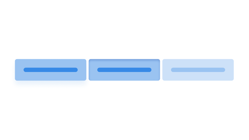
Buttons
Buttons trigger an event or an action.

Default button
Buttons are not styled on themselves. Instead, you have to add the .button class.
<button>Unstyled button</button>
<button class="button">Default button</button>
You can also use the .button class on links to make them look like buttons.
<a href="#!" class="button">Link disguised as a button</a>Icons
Icons can be used inside buttons. Putting them before the text makes them appear to the left of the button, and putting them after the text makes the appear to the right.
<button class="button">
    <svg>…</svg>
    Button to the left
</button>
<button class="button">
    Button to the right
    <svg>…</svg>
</button>
Icon only buttons are also possible by wrapping your text inside a span with class .visually-hidden.
<button class="button">
    <svg>…</svg>
    <span class="visually-hidden">Download</span>
</button>Zirconium buttons have paddings that double on the left and right sides. Because of this, an icon button looks rectangular. This can be fixed by using the .icon-only class.
<button class="icon-only button">
    <svg>…</svg>
    <span class="visually-hidden">Download</span>
</button>
Loading state
By adding the class .loading to your button, you can add a spinner to it to communicate that the process it triggered is still ongoing.
<button class="loading button" data-load>
    Toggle loading
</button>
Appearance
Primary
Use primary buttons to call the attention of your users. Use this to highlight the most important action in the UI. For the rest of the buttons, use the default appearance.
<button class="primary button">Primary button</button>No background color
Use buttons with no background color to represent actions that are less important than what default buttons represent. You can also use this in common actions like the close button in dialogs.
<button class="no-bg button">Button</button>You can also add the .primary class to the default .no-bg button to give it color.
<button class="primary no-bg button">Button</button>Sizes
Large buttons
Add .large to your button to make it larger.
<button class="button">Default button</button>
<button class="large button">Large button</button>
Small buttons
Add .small to your button to make it smaller.
<button class="button">Default button</button>
<button class="small button">Small button</button>
Disabled buttons
Disabled buttons are, accessibility-wise, not great. They communicate that something is wrong and the user cannot continue, but it does not clarify why and how to solve it. As an alternative to disabled buttons, it is better to use a regular button and show a note that explains why and how the user cannot continue.
You have not filled all required information.