Banners
Zirconium uses banners to present a notice of information.
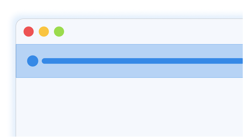
Banners are simple. Create a div with the class .banner
<div class="banner">This is a default banner</div>Banners with icons
Banners can have icons. It is recommended to inline svg instead of using an img to embed it in the page or using raster formats link PNG or JPEG. Inlining SVGs in the markup will make it inherit colors from its parent.
You can use any SVG you may find online, or you may also create one yourself. However, it is recommended to use Feather Icons.
Put your svg before or after the text. It is also recommended to wrap your text inside a .banner__text element.
<div class="banner">
    <svg width="24" height="24" viewBox="0 0 24 24" fill="none" stroke="currentColor" stroke-width="2" stroke-linecap="round" stroke-linejoin="round" class="feather feather-info"><circle cx="12" cy="12" r="10"></circle><line x1="12" y1="16" x2="12" y2="12"></line><line x1="12" y1="8" x2="12.01" y2="8"></line></svg>
    <span class="banner__text">Lorem ipsum dolor sit amet.</span>
</div>
Text truncation
Texts inside banners truncate when it gets too long. Normally, the limit is 65 characters. To prevent this, make sure to keep your notices inside banners short and to the point.
<div class="banner">
    <svg width="24" height="24" viewBox="0 0 24 24" fill="none" stroke="currentColor" stroke-width="2" stroke-linecap="round" stroke-linejoin="round" class="feather feather-info"><circle cx="12" cy="12" r="10"></circle><line x1="12" y1="16" x2="12" y2="12"></line><line x1="12" y1="8" x2="12.01" y2="8"></line></svg>
    <span class="banner__text">Lorem ipsum dolor sit, amet consectetur adipisicing elit. Suscipit incidunt quas, eaque dicta molestiae cum beatae magni illo modi nesciunt voluptatibus nisi architecto vel labore dignissimos fugiat autem nobis eligendi dolorum. Consequuntur quod voluptates dolorem.</span>
</div>
Types
Banners can also use colors to signify the nature of the notice inside it. Use .info, .success, .warning, and .error classes for this purpose.
<div class="info banner">…</div>
<div class="success banner">…</div>
<div class="warning banner">…</div>
<div class="error banner">…</div>Close button
You can give users an ability to close your banner when they have read your notice. Add a button with the attribute [data-close].
<aside class="info banner margin-top">
    <svg>…</svg>
    <div class="banner__text">Click this button to close this banner ->.</div>
    <button class="small square no-bg button" data-close>
        ×
        <span class="visually-hidden">Dismiss</span></button>
</aside>Use cases
Banners can be used for giving notice to the user. Banners normally sit at the top of the page so the user can see it immediately.
It does not contain any button other than the close button, as the users should not interact with it, except to close it. It is only meant to present information
Only use banners when it is actually important information. You can also use this component to announce new features that have been teased previously.
Do not use banners to spam the users to sign up for newsletters, or subscribe to a service.