Cards
Cards present information in a digestible manner.

Default Card
Cards are just containers for presenting information. You can put anything in them: text, code snippets, images, headlines, and such. By default, cards have borders.
<div class="square card"></div>To remove card borders, you can add the .no-border class.
<div class="no-border square card"></div>Cards are also display: grid by default. Adding things in cards lays it out in a vertical grid by default.
<div class="card">
    <h3 class="weight-light">This is a card</h3>
    <p>Lorem ipsum dolor sit amet, consectetur adipisicing elit. Ea dolore, cumque repudiandae id quia libero.</p>
</div>Cards can also have paddings via the padding utilities:
<div class="card padding-l">
    …
</div>
<div class="card padding-m">
    …
</div>
<div class="card padding-s">
    …
</div>
<div class="card padding-xs">
    …
</div>
Raised cards
Cards can look elevated by adding the .raised class. You can use the different shadow levels via the shadow levels utility classes.
<div class="raised card">
    …
</div>
<div class="level-2 raised card">
    …
</div>
<div class="level-3 raised card">
    …
</div>
Cards with image

<div class="bordered raised card padding-none">
    <img src="/assets/images/Placeholder.png" alt="" width="960" height="540">
    <div class="grid padding-l">
        <h3 class="weight-light">This is a card</h3>
        <p>Lorem ipsum dolor sit amet, consectetur adipisicing elit. Ea dolore, cumque repudiandae id quia libero.</p>
    </div>
</div>
Special Image Cards
Special image cards are image cards that use a different layout. This is the layout used in laying out blog entries for Antares Programming.

<article class="image-card">
    <img src="/assets/images/Placeholder.png" alt="" width="960" height="540">
    <div class="raised card" style="--grid-gap: var(--space-l)">
        <h3>This is a card</h3>
        <p>Lorem ipsum dolor sit amet, consectetur adipisicing elit. Ea dolore, cumque repudiandae id quia libero.</p>
    </div>
</article>
Special image cards can also be horizontal. This is used primarily to present featured blog entries. This can be done by adding the .horizontal class to .image-card.

<article class="horizontal image-card">
    …
</article>
Blurred Image Cards
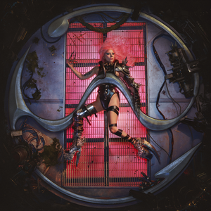
Cards can also be fancy and have frosted glass effect. This is used for cards that depict media content like video thumbnails and album covers. To make this work, do the folllowing:
- Add the class
.blurredto the.image-cardcomponent. - Using the
styleattribute on the.image-cardcomponent, set the value of the--blur-backgroundvariable to the URL of the image in the image card.


<article
  class="blurred image-card"
  style="--blur-background: url('album_cover.png')"
>
  <img
    src="album_cover.png"
    alt="Lady Gaga - Chromatica (Official Album Cover).png"
    width="300"
    height="300"
  />
  <div class="card">
    …
  </div>
</article>Hoverable Blurred Image Cards
Hoverable blurred image cards hide the content, showing only the image part until the card is hovered on, or it or one of its children receives focus. To make a blurred image card hoverable, use the .hoverable class.


<article
  class="hoverable blurred image-card"
  style="--blur-background: url('album_cover.png')"
>
  <img
    src="album_cover.png" alt="…"
    width="300" height="300"
  />
  <div class="card">
    …
  </div>
</article>